Barcelona's 'cool mint' reveals sorry lack of taste
Posted Wednesday, February 23, 2011 by theguardian.com
Meddling with team shirts has become so routine that the Catalans' latest offering provoked more bafflement than anger
Over the past 30 years Barça have been through the rainbow with their away kit, from the primrose of the Catalan flag to several variations of the turquoisey teal to which they have reverted this season.
Meddling with the colour and design of kits has become so routine that the latest transgressions tend to provoke more bafflement than anger, Arsenal's victory over Barcelona at the Emirates last week providing two examples that could not be overlooked. First, the officials wearing white shirts simply did not seem right. The eye-catching gimmick gave the referee, Nicola Rizzoli, no chance of trotting out the old cliche at the end of the match about the best referees going unnoticed even if he had performed flawlessly.
At the end of his time at Leicester City, Peter Shilton took to sporting an all-white kit at the behest of his sponsor but stopped shortly after Liverpool's Kevin Keegan beat him from outside the box during a 1974 FA Cup semi-final replay at Villa Park. The prominence of the goalkeeper's choice of clothes among the reds and blues of the 20 outfield players was made all the more striking when illuminated by the floodlights and betrayed a rare lapse in his positioning that Keegan exploited with a sweetly struck snap-shot. Of course referees have to be conspicuous, but white does not only fly in the face of tradition, it is too much of a distraction.
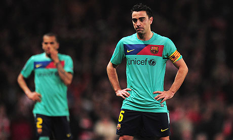
Second, Barcelona, were hogging possession and formulating their patterns in shirts the manufacturer describes as "cool mint". Over the past 30 years Barça have almost been through the rainbow with their away kit, from the primrose of the Catalan flag, to orange, vibrant salmon pink, silver, gold, navy, acid-house-meets-lollipop-man fluorescent sulphur and several variations of the turquoisey teal to which they have reverted this season. Worn with matching thermal polo neck undershirts, the kit made Xavi and co look like pastel-clad versions of those aficionados of the turtle-neck, André Previn and Harold Pinter, on the Parkinson show circa 1975. Vertical, diagonal and now horizontal blaugrana sashes have been tried to keep the iconic first-choice colours uppermost in people's minds in the absence of a clash, like at the Emirates, where the usual kit would have sufficed.
Abuses of the colour palette have been going on for ages and although some can claim inspiration from a particular club's history – Tottenham in chocolate brown, Everton in pink, Manchester United in green and gold – others such as Aston Villa's disgusting green, black and red stripes from 15 years ago or Arsenal's green with blue sleeves from a decade earlier were put together at the designer's whim.
With apologies to Plymouth and Yeovil fans, there is a common denominator here. Green simply does not work for club football kits unless a historical association buys it some leeway. The purely commercial, such as Liverpool's Carlsberg can and Adidas homages that began under Graeme Souness and were amended if not improved over the next 20 years, never manage to look anything other than faddish.
At merchandising launches in the mid-90s you would often hear the marketing view that shirts were being specifically devised to go with jeans and perhaps a focus group decided that green was the very hue to accompany stonewashed denim. Such was the proliferation of silver, grey and blue that you would be forgiven for thinking the creatives at the manufacturers viewed football fans as permanently trousered in the manner of Status Quo's Francis Rossi. And despite Manchester United's infamous "invisible" battleship and red shirt, and England's Euro 96 granite, frequently cropping up among lists of kit nadirs, they sold in huge quantities.
Adidas had an away kit template in the late 80s, the silver and white of Liverpool, blue and white of Manchester United and yellow and blue of Arsenal made up of odd maple leaf shapes merging into each other. The Arsenal one was dubbed the kitchen-curtain kit but all three looked as if they were striving too hard to be trendy and mucked up the basic principles of simplicity and authenticity.
York City's promotion to the Second Division in 1974 was marked by making them run out in red shirts with a giant white Y on the front that had to be adapted if you found it in the Subbuteo bargain bin with a tin of Hummel to transform them into a more versatile model. City's "Y-fronts" understandably did not last long, the mocking nickname doing the job club officials should have done at the start.
Such seemingly trivial things do matter. It makes a difference, for instance, if Juventus play in thick or thin stripes, in black or white shorts, because the classic design is part of the club's character. Building tradition is difficult enough without recourse to pinstripes and chevrons, bibs and rib flashes. "Cool mint" may conjure up memories of Hristo Stoichkov, Romário and Ronaldo, but there is a reason why certain clubs put on the home shirt to receive a trophy after winning a final wearing something radical.
At that point they want to emphasise their identity, something teal is never going to reveal.
Photos
More»


Arsenal to seal three signings THIS WEEK
Tuesday July 15 2025


Your Say